


A Friendly Guide to Data Storytelling - Part 1
In this two part series of Data Storytelling, We will focus on how you can do Data Storytelling better.
Data storytelling is a structured approach for communicating data insights, and it involves a combination of three key elements: Data , Visuals and Narrative.
- Forbes
If you are in the field of Analytics, Business Intelligence or Marketing or aspiring to step your foot in, you cannot miss out on this must-have skill, Data Storytelling is a methodology to communicate insights and findings to a targeted audience in an effective and compelling way.
This is Part 1 of our series on Data Storytelling. Links to all the parts -
Part 2
In Part 1 of this series, We have discussed -
Importance of context
Breakdown of some poor visualizations
Practices of good visualizations
Conclusion
If you like our writing, do encourage us by Subscribing and Sharing
The Context
Before you begin creating visualizations it is important to understand the context meaning what has to be accomplished with the Visualization. Hence your Exploratory analysis has to be thorough i.e what exactly you can dig out from the data that could be worth sharing and generate interest within the audience. Here are some questions that you can ask yourself to help you with the analysis -
Who is my audience?
What answers am I finding for them?
What questions can arise or they might ask?
What conversations it can spark?
Once you have a clear understanding of the above points you can go onto visualize the data. Visualizations are just not about creating mere Charts and Graphs but it also has to be captivating.
Often people have a misconception that the more complex their Visualization is, the better it is. While in reality that does not hold true.
Let us look at some poor visualizations and understand what is wrong with them-
1] Untidy
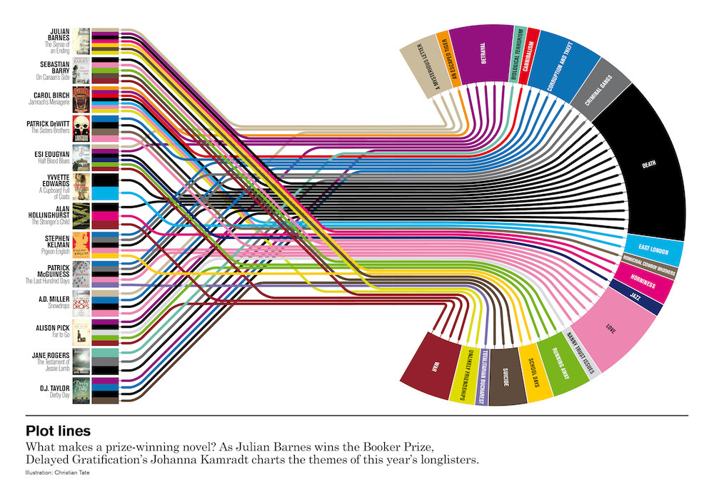
A complex visualization like this does not help you in understanding the context at all. Everything looks cluttered, hence one cannot clearly make sense of what does the visualization has to convey.
2] Misleading
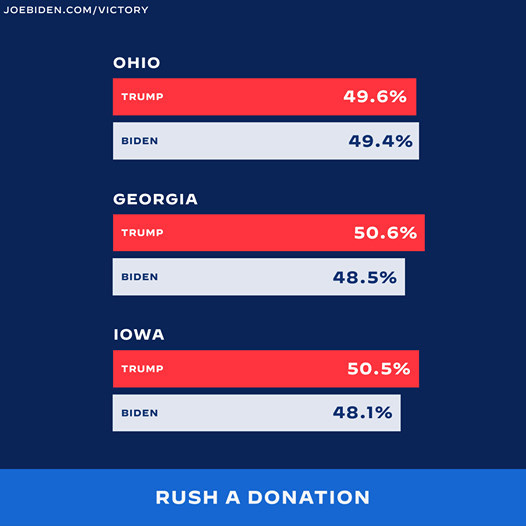
Unlike the first one, the above Visualization looks good and neat. But if looked closely, something does not seem right. For Ohio, Biden with lesser numbers is shown to have an edge over Trump which is an example of ‘False Visualization’. In real-world, there are often such misleading visualizations used to make people falsely believe facts.
3] Confusing
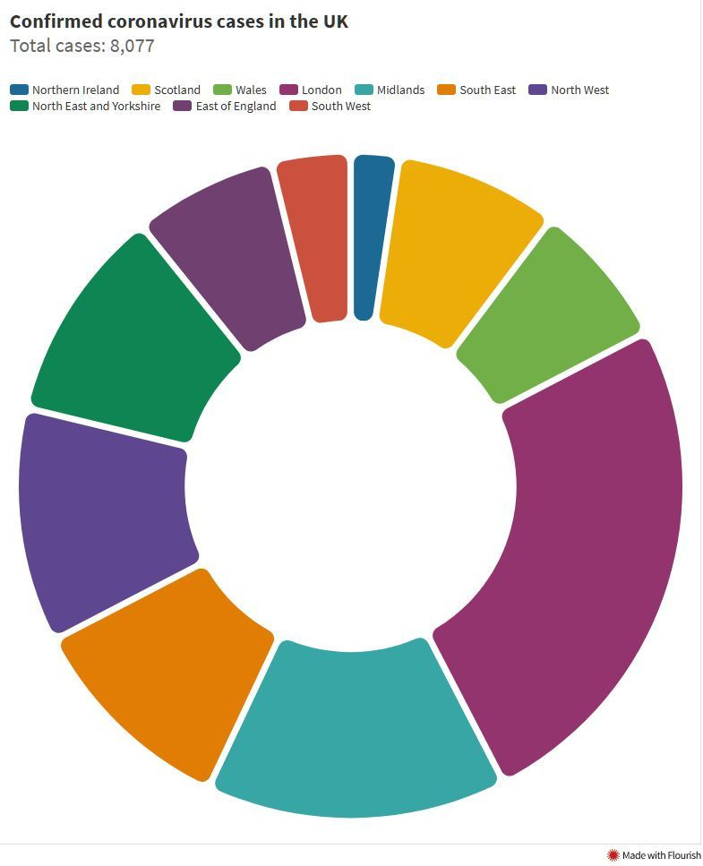
The above Donut Chart may look just right but there are few problems. There are many labels & colours to the Donut and you will have to keep looking at the legend & the chart again and again to identify. A correct approach would be to use a Horizontal bar instead. Often Horizontal bars are best suited for categorical data.
Hope that helped you to understand the mistakes you should be avoiding while making Visualizations.
Hence it is important that a Visualization is clean, captivating and easy to interpret.
While there are various Chart & Graph formats available that are popularly used, We have picked some examples to explain little bit about it.
1] Map

Using Maps is a go-to choice when you have geographical data. Here is a good example of how to represent geographical data neatly with the help of Heatmaps, it gives a clear understanding of the numbers across points.
2] Horizontal Bars

Horizontal bars are often a common choice when it comes to categorical data. In the above visualization, the data can be easily understood. While colours help to highlight the particular sub-category items. Notice how quickly you can spot the two items in red bars with the help of colours.
3] Line Chart

With periodic data, you can represent the numbers using a line chart which effectively shows how each of the categories have performed quarterly and it is easy to read, helping you give a fair idea.
4] Pure Numbers
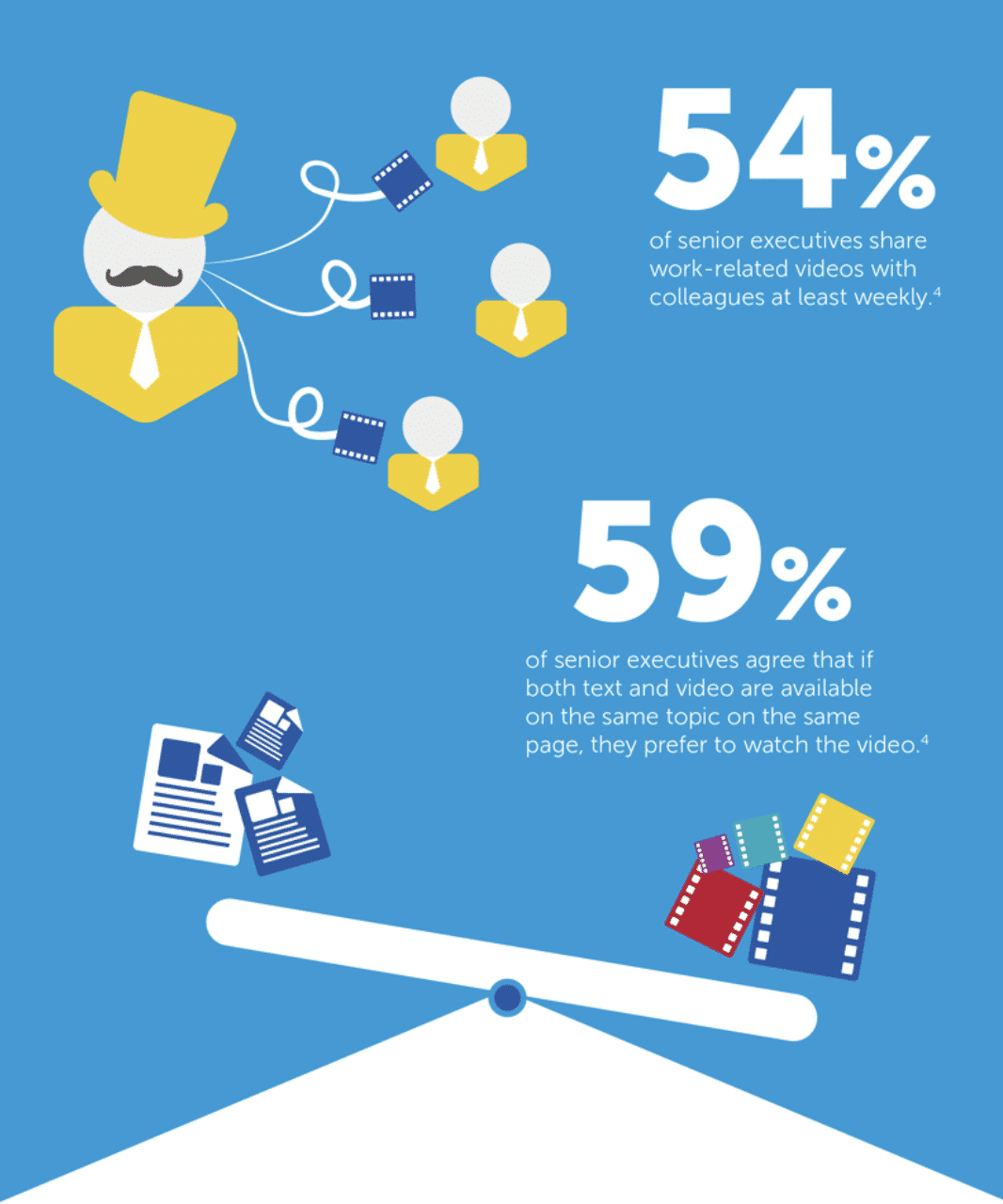
Also having numbers do not always mean to have some sort of graph or chart for it, sometimes numbers along with a little description can be sufficient to make a point. Notice how simply plain numbers emphasize the picture here in the example above.
5] Dashboard

At last, you can use a Dashboard like this to effectively convey the story.
A dashboard is a collection of several views, letting you compare a variety of data simultaneously. For example, if you have a set of views that you review every day, you can create a dashboard that displays all the views at once, rather than navigate to separate worksheets.
- Tableau
So let us recollect what you should consider while making a data visualization:
Keep the Visualization simple. There can be multiple ways to represent the data but more often simple visualizations tend to grab viewers’ attention faster and makes the point clear easily. Try identifying clutter in your visualization and reduce it as much as possible. Look-out for trends or patterns within your data that can be noteworthy to share.
Colour is a powerful tool. Use colours/shading effectively to draw the audience’s attention as it helps viewers understand the information more precisely within the Graph or Chart and to highlight the contrasts within your Data. Make sure you choose the right Colour palette. Colours should be used to ease the readability, hence do not use too many colours (generally not more than 5-6) as well because it can be confusing to read, your visualization does not necessarily have to be colourful. A pinch of it also can also make quite a difference.
In the end, make sure your Visualization is understandable by proofreading. Try seeing it from the audience’s perspective if they will be able to catch the point that you are trying to make. More on this will be covered in the upcoming part so stay tuned!
Conclusion
Data Storytelling is an important skill one should have. It helps to deliver insights effectively by adding meaning & value to the stats. You can use any tool for that sake, we have used Tableau here to demonstrate some examples.
In part 1 of our series, we talked about the context, illustrations of some good visualizations and some of the mistakes that you should be avoiding.
In the next part, we will further discuss how to deliver data stories.
Do share, subscribe and support Coffee and Engineering!